Monday, April 30, 2012

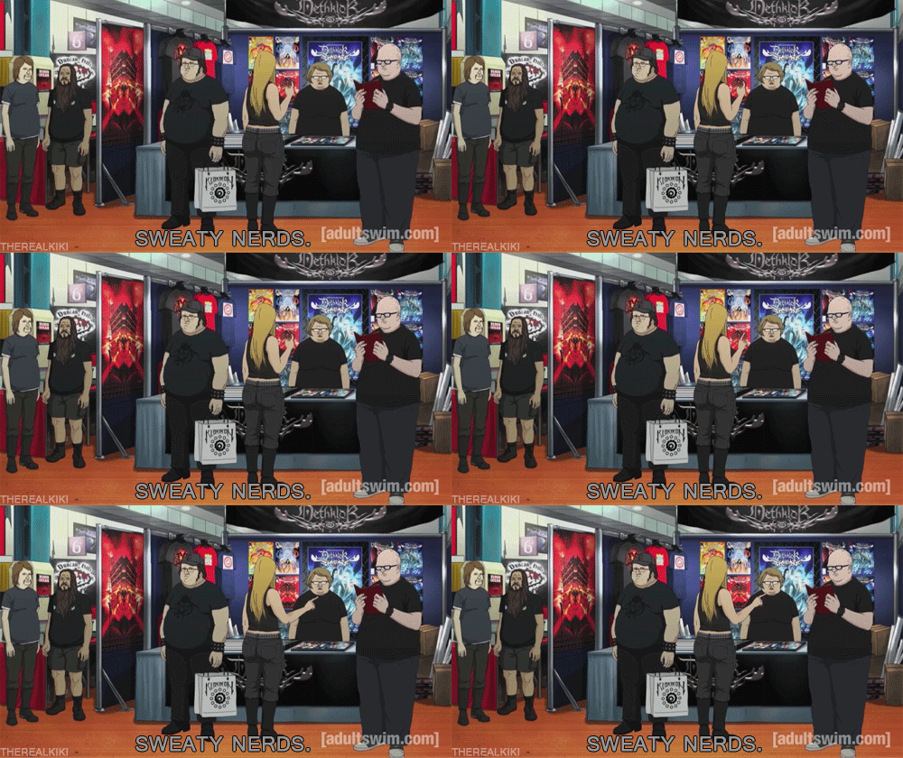
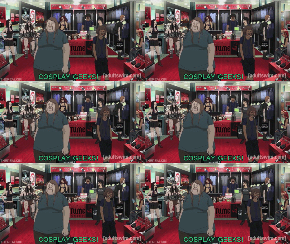
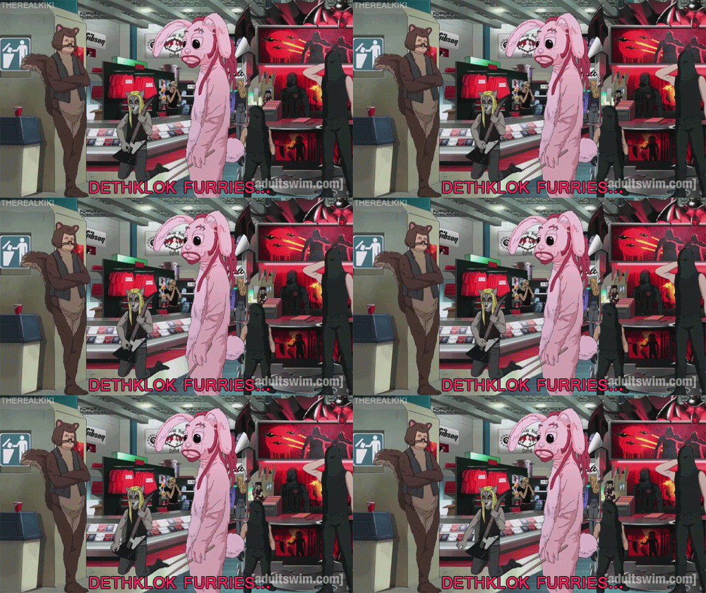
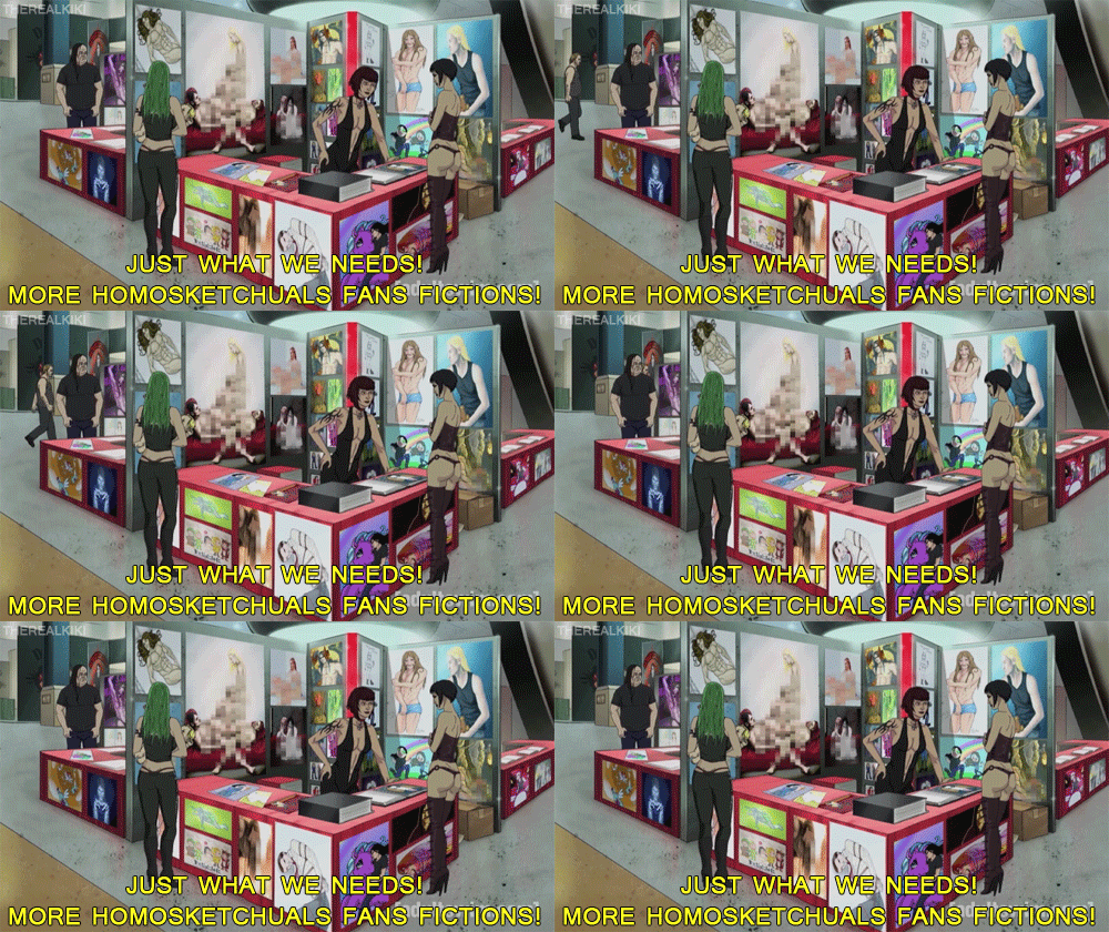
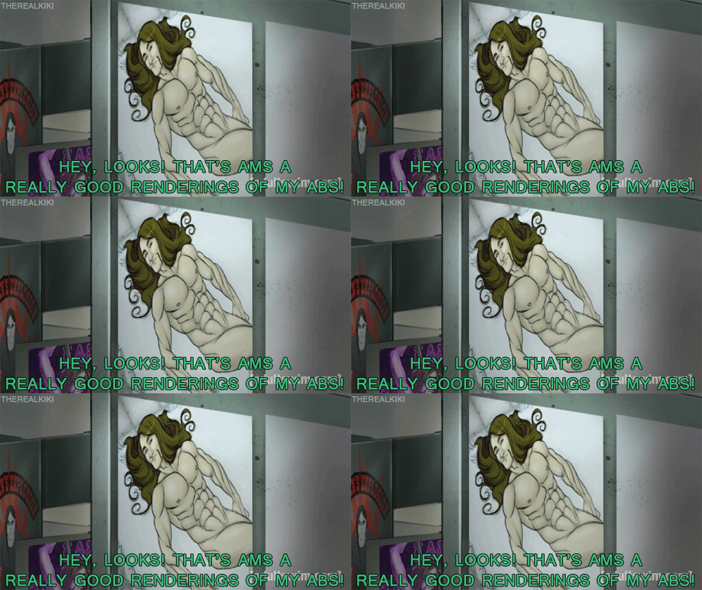
nachtflix: degenezijde: quhzk: Best reference to fandom in a...


nachtflix:

degenezijde:

quhzk:

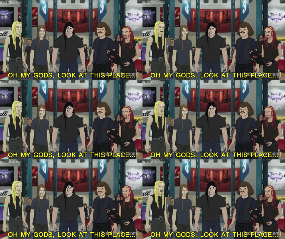
Best reference to fandom in a tv-show so far :D

>Metalocalypse furries

>Metalocalypse slash

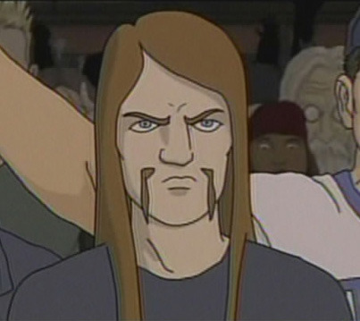
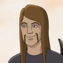
I’m still lukewarm on the show, but I love Toki!

Hah! awesome. And I love Metalocalypse, personally, but I’m kind of a metal head. but yeah, I love Toki, he’s my favorite


Imported from Tumblr: http://rayegunn.tumblr.com/post/22155939062

My Top 5 Artists (Week Ending 2012-4-29)

  1. Muse (30) 
  2. Eluveitie (25) 
  3. Anathema (20) 
  4. Finntroll (16) 
  5. In Extremo (15) 

Imported from Last.fm Tumblr by JoeLaz


Imported from Tumblr: http://rayegunn.tumblr.com/post/22154745163

Sunday, April 29, 2012

.... fuck Internet Explorer

Seriously. I sat down to style the blog on my website, since without it the posts kinda blurred together and it was hard to tell where one ended and the next began, so I added a faux dividing line, and removed the ordered list (well, hid. Why does Tumblr thing we want our embedded posts numbered, anyway?)

For those that know CSS, This is the code I ended up with (and, yes, Tumbler apparently doesn’t use it’s own class for the ‘ol’ but, but luckily I don’t use ordered lists elsewhere on the site):

ol li {
    list-style-image: none;
    list-style-type: none;
    margin-bottom: 20px;
    margin-left: 0px;
    border-bottom: 2px solid #9fc9d9;
    padding-bottom: 15px;
    position: relative;
    right: 20px;
}

.tumblr_title, .tumblr_link {
    font-family: Arial, Verdana, Helvetica;
    font-size: 18px;
    display: block;
    color: #ffffff;
}

.tumblr_text_post ol li {
    list-style-type: decimal;
    margin-bottom: 0;
    padding-bottom: 0;
    border-bottom-style: none;
    background-position: 0 .1em;
}
tumblr_caption{
    font-size: 14px;
    font-weight: bold;
    margin-top: 10px;
    padding-right: 20px;
    padding-top: 0px;
    padding-bottom: 0px; 
}

the rest I left up to my site defaults, which i haven’t changed. And yes, I realize that will be gibberish to some of you. But anyway… spent much tweaking getting it all right, and was pleased with the final results looking at them in Firefox. then I opened it in IE.
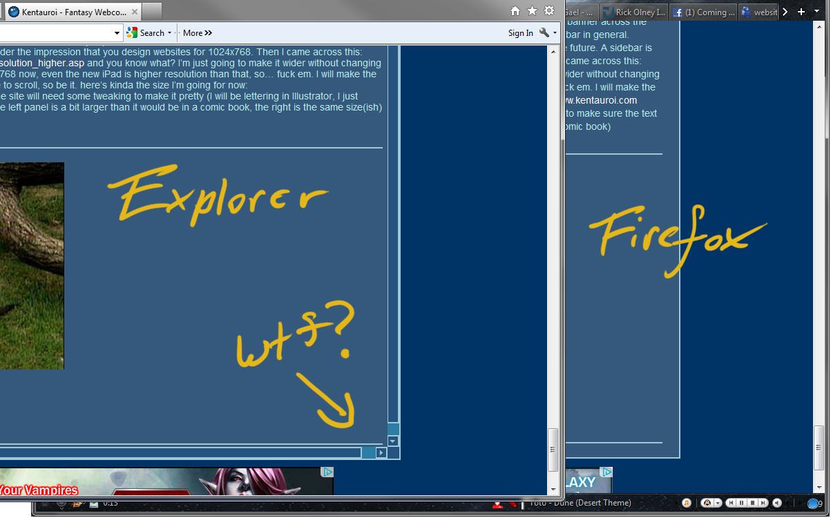
fuck IE.

Seriously. what the fucking hell? why did the overflow trigger? The only box/div where the overflow triggers is the blog one, but I didn’t add anything that would change the height or width of the content! I thought it might be the positioning thing which moves it all over 20 pixels to the left (because it’s a list, the numbers are just hidden, it was bumped over to the right) but nope… I do have an IE only stylesheet for just such fuckups on IE’s part, but I have no idea what’s causing it to misbehave this time…


Imported from Tumblr: http://rayegunn.tumblr.com/post/22109588920
Don't feel so bad about not going to the Expo anymore...

Don't feel so bad about not going to the Expo anymore...:

Yeah. so, I didn’t go to the Calgary Expo this year despite actually living in Calgary. Couldn’t justify the money, not just getting in, but you know there would have been other things in there tempting me to purchase them… Was kinda sad about it cus they had some awesome guests lined up. Now, not so much after reading that article. I probably couldn’t have gotten in if i wanted to considering i would have been buying tickets at the door. I also saw on the news what the line looked like, holy shit, hadn’t seen a line like that since SDCC.  I hope they do something next year to fix the problem. A bigger venue, a cap on tickets sold, something… It was clearly attended by far more people than they expected. I mean, it’s good, it’s a relatively new convention, I remember when they held it out of  a single room lasting an afternoon on it’s first year, and now it’s grown to a three day event and is one of the largest Comic Book conventions in Canada (I think second only to Toronto, though it may have passed that this year) It’s great for Calgary to have a large convention like this, once Kent gets going, I hope to have a table in Artists Alley or their Small Press/Webcomics section… but man, what a clusterfuck this year.


Imported from Tumblr: http://rayegunn.tumblr.com/post/22096841292

Saturday, April 28, 2012

Portal 2 Perpetual Testing Initiative (by Valve) eeee! :D...


Portal 2 Perpetual Testing Initiative (by Valve)

eeee! :D I’m gonna play so much Portal 2…. May even take a stab at level designing, though don’t have any ideas at the moment.


Imported from Tumblr: http://rayegunn.tumblr.com/post/22001915824

Thursday, April 26, 2012

Escher Girls: I just wanted to say something

Escher Girls: I just wanted to say something:

eschergirls:

namidaaz submitted:

This is actually drawn by me, but I just wanted to say something. Some people like to use the excuse that “Oh, thats just my style!” but there is a difference between style and flat out error. My style tends to naturally be very thin and curvy, and a lot of other…

I am all for stylization, and don’t like objectification of women. But that doesn’t mean androgyny, stylizing them so they both look essentially identical, is the right way to stylize without objectification. The ‘man’ here has gone beyond androgynous, you’ve lost what it is to make a man a man. I mean, if androgyny is what you want do do, fine, seems to work for bishonen, and I’ve drawn my share of ‘pretty’ men. But to say that’s the only right way is being incredibly myopic and is nearly as offensive, by putting forward the idea that curvy women (or muscular men) should be ashamed of their bodies, that we should pretend they don’t exist.

Stylization is often exaggeration, to act as a visual shorthand, so you accentuate the masculine traits on a man, (broad shoulders, narrow hips, etc.) and the feminine traits on a woman, (broad hips, slighter frame, and, yes, sometimes boobs) and there is nothing wrong with that. As long as both men and women are stylized, it can be in different ways. Stylize based on gender first, then expand on it for character. Not all women should look the same, just as not all men should look the same.

In short: Accentuating the feminine form is not objectification without context. It becomes objectification when you stick them in a demeaning pose, situation and/or costume, not just by virtue of their proportions.


Imported from Tumblr: http://rayegunn.tumblr.com/post/21878152008

Tuesday, April 24, 2012

bahamasalami: leasthelpful: “Loved all the murders but the...


bahamasalami:

leasthelpful:

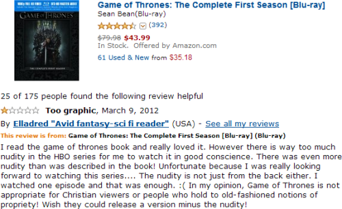
“Loved all the murders but the privates offended my religion :(“

Lol, propriety, like we’re living in fucking Victorian times. And I don’t even think the reviewer even knows what propriety is. A comment about the nudity on GoT: they only ever show frontal nudity of women, never of the males. Wonder why that is :|

um. actually… they did show male frontal nudity… I remember, because it was surprising since there usually is a double standard of showing male vs female nudity.  It was only one scene, granted, but they did show it. Theon Greyjoy, to be specific.

But yeah! Dunno what exactly what they were expecting from the show, it’s not as if the books were lacking in fucking, and that typically involves nudity.


Imported from Tumblr: http://rayegunn.tumblr.com/post/21752411116

Sunday, April 22, 2012

Kent website again

After still being concerned with the resolution of the comic, I had been waffling back and forth on the site design, playing with the idea of completely scrapping the site design to allow a larger comic. But I really didn’t like the idea of using a big horizontal banner across the top, (and I AM having banners, I want to make at least a little bit of money for the time I put into it) or losing the sidebar in general. Besides the banner, I have the donate button, my Twitter, and  I can put polls or… who knows what else there in the future. A sidebar is handy. But I was doing that because I was still under the impression that you design websites for 1024x768. Then I came across this: http://www.w3schools.com/browsers/browsers_resolution_higher.asp and you know what? I’m just going to make it wider without changing the layout. Over 85% of people are above 1024x768 now, even the new iPad is higher resolution than that, so… fuck em. I will make the comic larger, if people running at 1024x768 have to scroll, so be it.


Imported from Tumblr: http://rayegunn.tumblr.com/post/21597815950

Monday, April 16, 2012

THE SIMPSONS - Bill Plympton Couch Gag from “Beware My...


THE SIMPSONS - Bill Plympton Couch Gag from “Beware My Cheating Bart” (by FoxBroadcasting)

I think this is pretty cool.


Source: http://rayegunn.tumblr.com/post/21215151946

Another addition to the blog pile

Added another duplicate of this blog via ifttt, this time at Wordpress… pretty much just because I had set up a Wordpress account to comment on another blog, and I may as well. :p http://rayegunn.wordpress.com/ this post is basically just to make sure the recipe to copy it over works right.

so if you want to follow this blog, the tally so far is:

http://rayegunn.tumblr.com/ (the root blog from which the others get copied)

http://rayegunn.wordpress.com/

http://jilljohansen.blogspot.ca/

http://raye.posterous.com/

http://www.facebook.com/RayeGunn


Source: http://rayegunn.tumblr.com/post/21212734821

Sunday, April 15, 2012

Kentauroi website... need opinions

I’ve been getting the website in order, and that includes making a final decision on the size/dimensions of the comic itself. I have definitely settled on pages that are regular comic book dimensions, (with bleed area, gutters trimmed) but cut in half, to make it so you don’t have to scroll to see the whole page, and I can then make a regular sized trade later, if it proves popular enough. I dunno, go look: http://www.kentauroi.com/comic/ I look at it, and it seems small, but I hold a comic book up to it, and it’s nearly 2 inches wider… so… but if i make it too much wider, it could break the layout for people with lower resolution monitors. What do people think? (say in the Disqus comments there, that could use testing, anyway) Also, you may notice it has a redirect… only way i can make it so the comments stick with the strip. Seem acceptable?


Source: http://rayegunn.tumblr.com/post/21179449305

Friday, April 13, 2012

Oh, and people bitching about the latest issue of Stormwatch "destroying years of characterisation" need to realise this isn't the same Midnighter from The Authority. The New 52 was a reboot. This Stormwatch is not the old Stormwatch. "Daddy Midnighter" no longer exists. So as far as "destroying years of characterisation" goes; bull!

I think most of us realize that. Doesn’t mean we have to LIKE it, though. Old Midnighter>NuMidnighter.

I mean, at this point they’ve changed so much, his personality, his powers, his costume, his skin and hair color… why even bother calling him Midnighter?


Source: http://rayegunn.tumblr.com/post/21027196543

templesmith: A little bit of Joker to celebrate the news I’m...


templesmith:

A little bit of Joker to celebrate the news I’m drawing a bit of a BATMAN story with B Clay Moore. (Taken with instagram)


Source: http://rayegunn.tumblr.com/post/21026730482

Wednesday, April 11, 2012

My Top 5 Artists (Week Ending 2012-4-8)

  1. Apocalyptica (33) 
  2. Between the Buried and Me (25) 
  3. Michael Giacchino (22) 
  4. Zoë Keating (22) 
  5. Ayreon (17) 

Imported from Last.fm Tumblr by JoeLaz


Source: http://rayegunn.tumblr.com/post/20922854571

9-year-old's DIY cardboard arcade gets flashmobbed - Boing Boing

9-year-old's DIY cardboard arcade gets flashmobbed - Boing Boing:

This is so awesome, I love it <3


Source: http://rayegunn.tumblr.com/post/20921722014

Witcher 2

Just re-downloaded The Witcher 2 from GOG.com, in anticipation of the ‘Enhanced Edition’ (and console version) being released on the 17th. Looking forward to playing it again and seeing the new stuff they added! I love this game, one of my all time favorites, and I love that they released all this new content for free. I pre-ordered it from gog.com back when it was first released to make sure the CDProjekt guys got the support they deserved, they’re one of the good game devs. Beautiful game with a rich story, where your choices have HUGE consequences on the game, and no trying to bleed you dry with DLC, all the new stuff is free, and they are anti-DRM.

I put off playing when they updated it with Dark Mode and such, cus I knew an Enhanced edition would be coming, so I will have lots to do. A little sad they nerfed the difficulty; I made it through on it’s original difficulty though, so, bragging rights I guess. And then, when Witcher 3 hits, I shall do a giant Witcher marathon to get the perfect import save games. :D

here’s one of the new cinematics:

If you haven’t played it, I highly recommend it. It hits on consoles on the 17th, so even if your computer isn’t up to it on the PC you can still play it!


Source: http://rayegunn.tumblr.com/post/20896801802

Tuesday, April 10, 2012

560 - A World Map of Heavy Metal Density | Strange Maps | Big Think

560 - A World Map of Heavy Metal Density | Strange Maps | Big Think:

This is pretty awesome. Also, explains why I like so many Finnish bands…. I like that Canada is totally more metal than the USA. \m/


Source: http://rayegunn.tumblr.com/post/20848609476

Monday, April 9, 2012

Stormwatch 11 cover. Apollo went and got himself a black...


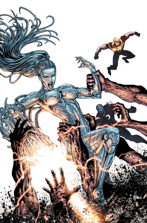
Stormwatch 11 cover. Apollo went and got himself a black costume. O.o I don’t hate it, but it will take some getting used to, he’s never worn black costume before, always white and yellow. Also, I question their priorities, if anyone needed a costume change, it was Midnighter. As for the star of the cover, Angie looks SO much better int the new sleeker design. That bulky thing she was in for the first 6 issues was just blech.


Source: http://rayegunn.tumblr.com/post/20782575052

Sunday, April 8, 2012

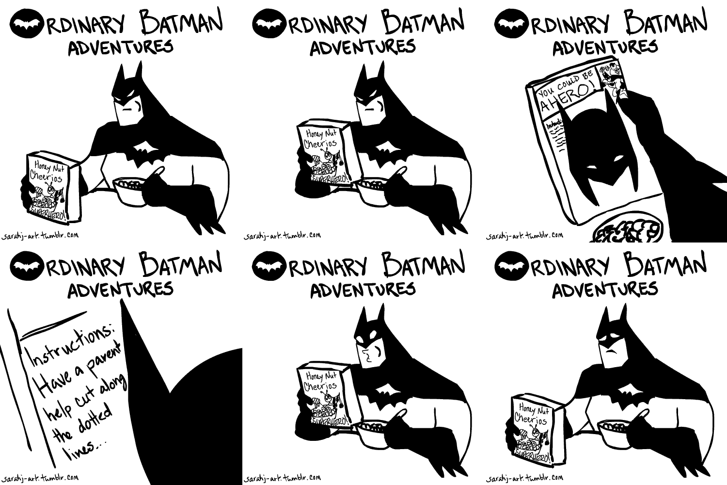
sarahj-art: Ordinary Batman Adventures! Poor Batman… Idea came...


sarahj-art:

Ordinary Batman Adventures!

Poor Batman…

Idea came from How To Be Batman. (I think that’s the original source?)

Aw, poor Bats…


Source: http://rayegunn.tumblr.com/post/20765964447

btothef: Back To The Future as a silent film - it is amazingly...


btothef:

Back To The Future as a silent film - it is amazingly well done!  HAPPY EASTER, THIS IS YOUR PRIZE


Source: http://rayegunn.tumblr.com/post/20765936780

Monday, April 2, 2012

We can get Midnighter's costume back

We can get Midnighter's costume back:

Peter Milligan posted: “Hmm. You make some interesting points, Rayegunn, and I’m always ready to listen to a “fangirl”. Must admit, I’m a bit ambivalent about Midnighter’s chin spike. Does anyone else have any strong opinions on this subject?”

Come on people, let’s make this happen, go let Peter know that the chinspike needs to go and he needs a coat.


Source: http://rayegunn.tumblr.com/post/20368509428